SCL Health Platte Valley Medical Center Third Floor Med/Surg Unit
Brighton, CO
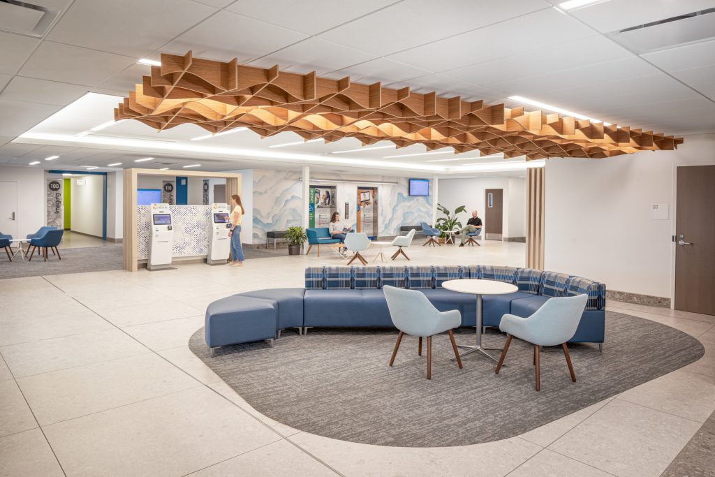
This project was a build-out of a 19,010 s.f. existing shell space to create a third floor, 28-bed medical/surgery unit at SCL’s Platte Valley Medical Center (PVMC). With the program already in place—mimicking the second floor—the goal was to understand and improve upon the lower floor’s design to bring a premier patient experience to this smaller community east of the Denver metro area.
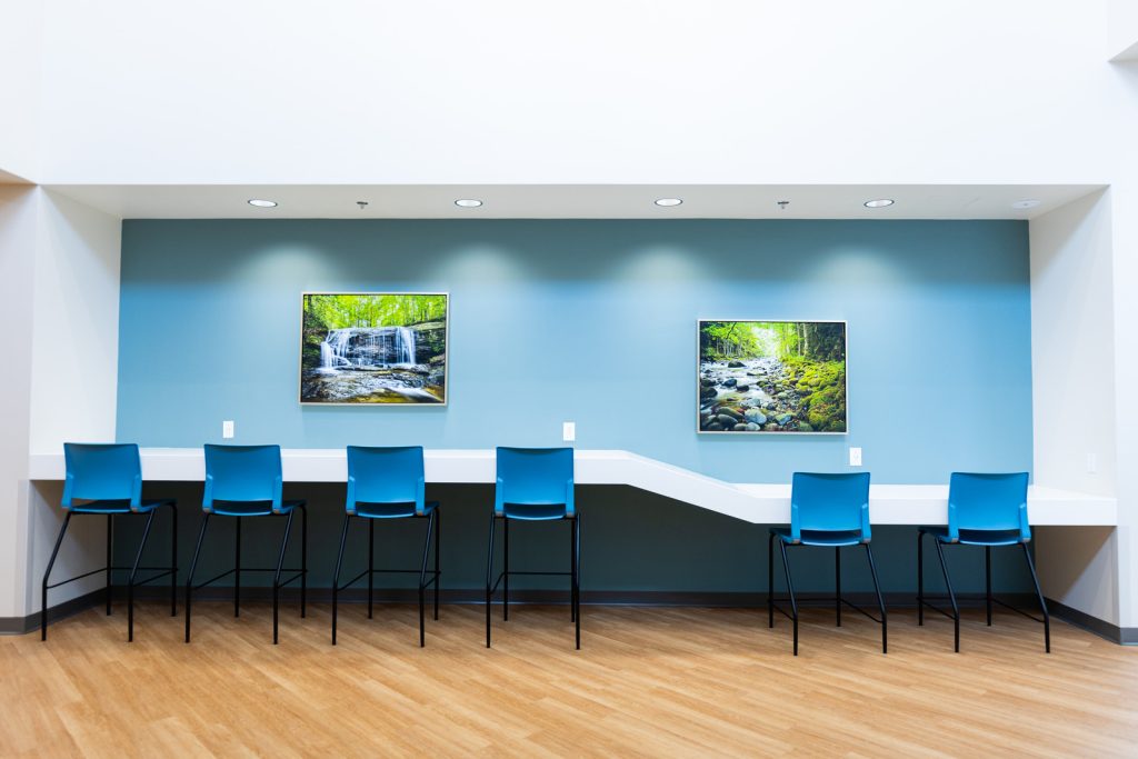
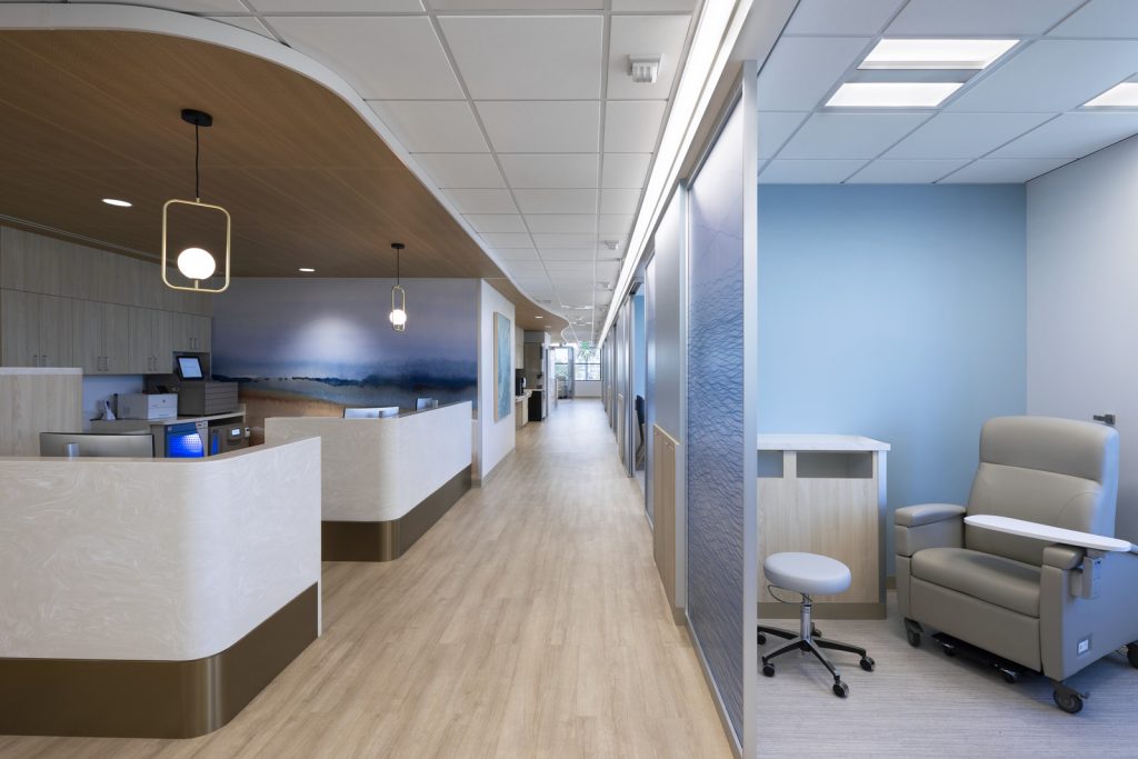
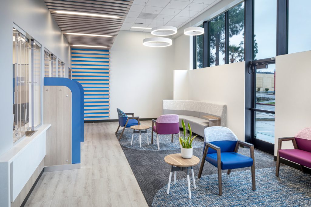
The building’s atypical, fish-like footprint presented the team with a design challenge to fit all the components of the 28-bed program efficiently in such a way which optimized patient and staff outcomes. Our team worked with SCL staff to come up with a solution which ensured a focus on both patient- and staff-centric aspects of the project. Highlighted by abundant natural light, each patient room features ample space for visiting family members. Rooms are designed for ease-of-use by both staff and patients. Further improvements included the use sliding instead swinging doors, and moving the charting station and the visitor’s couch to create more space in the the room to leave the entry area clear for staff. Diagonal halls with adjacent office space, as well as comfortable waiting areas for families and visitors, cut across the floor to create quicker access across the long hallway.
The project benefited greatly from the involvement of BA/Science, using design research and lean approaches that helped the design team deliver a facility that optimized operational flow and patient care.
Using research to learn from data
The BA/Science team recommended a validation phase—a pre-design study of the existing second-floor medical/surgical unit that would allow for the deeper understanding of what was working and what wasn’t. They gathered data from the existing second-floor operation to set performance goals for the third-floor unit. These would focus on patient safety, patient experience, clinician effectiveness, and clinician experience and health.
They analyzed nurse call-light response times and performed observations at nurse stations, patient rooms and corridors, to better understand staff workflows, communication, visibility, and processes, stress, fatigue, and satisfaction, accessibility to supplies and equipment. They measured light and decibel levels, evaluated patient privacy, and risk of injury, among other outcomes to compare against scholarly and industry benchmarks and propose new strategies which would facilitate a better environment for both staff and patients on the new third floor.
The validation provided benchmark data and optimization targets for the new third floor allowing the team to solve problems in a way that wouldn’t just repeat what was on the floor below. As a result, the team ended up totally reworking the core.
Hands-on input from clinical staff
The team held a Paper Doll design workshop for the central core, and a Cardboard Mockup Workshop for patient rooms. This involved bringing in a diverse group including the design team, but more importantly a range of the clinical staff, including the CNO, the medical/surgical unit director and her key nursing and clinical personnel.
The groups were split and separately did two sets of paper dolls to try and solve their problems. They were given a copy of the plan, and squares of paper to sort out locations for their desired layout from everything as minor as lockers and break room locations to the PT gym and nursing stations. They learned they had to deal with columns, mechanical shafts, elevators, plumbing, stairways—they began to understand design constraints, which led to some real “aha” moments.
Ultimately three options from each group were presented to the entire workshop group. Two of those options were then picked for the BA design team to refine and design further, then brought back to the Platte Valley team for their final approval before beginning the traditional design process. Among the key changes common to both schemes involved sizing and layout of medication rooms to facilitate drug safety and staff efficiency, main nursing stations located in a central location supported by satellites, and flexible seating options for visiting families. The research team evaluated the two design concepts across the projects evidence-based performance goals by conducting a sightline and nurse travel distance analyses.
Because the third-floor space was shelled, the design team took the opportunity to mimic second-floor rooms with in-place cardboard mockups to identify specific areas for improvements. Two mockups were created, one of an existing patient room and one as a “blank slate.” The team evaluated the current room to see what worked and what didn’t. Staff findings and suggestions included locations of nursing charting stations, sink locations, as well as input on lighting, finishes, door swings, and space saving alternatives for the family area.
With this validation, BA’s team then made those strategic changes to the patient room. Since the third floor was basically half occupied at the time, the shell space allowed them to actually mock up live in the space. They then had former patients, staff, community members, and patient advocates come in give us further input. The design team took that feedback and immediately implemented it into the drawings.
